
This week on the podcast I’ve got Emanoel Melo talking to me about character sheets. It’s such a visual subject, and there were so many more sheets I wanted to talk about than we had time for, that I thought I’d put together a companion blogpost here with some bonus thoughts and content.
I’ll start off by repeating what I say in the intro of the podcast: I’m fascinated by character sheets, mostly because there are so so so precious few that I think do a really good job. I don’t mean this to call anyone out - I think the job of making a good character sheet might genuinely be impossible.
It has to accomplish SO MANY things. Be a quick reference document, but also contain every piece of information a player could conceivably want at the table, and also be visually compelling, convey the tone of the game, AND ideally fit on a single sided US letter page while having font large enough that it’s still legible. Woof.
Still, I think there are a few real winners out there, and some stinkers worth learning from (or just really basking in the stink of).
Let’s start off with what we cover on the podcast. First up, Mothership:

This is the 0-edition sheet, and it’s the first character sheet I ever saw that I really loved. It looks like shit, but that’s kind of the point. As characters, you’re blue collar workers dealing with technical manuals that are gonna look like this. It’s extremely functional (if you don’t get lost in the arrows), and it fits character creation right on the sheet in a visual way. It’s fabulous.

This is a sheet for 0e from community member Quadra. Quadra takes the original sheet, curves up all the corners (pleasing), makes all the flowchart lines cleaner, and compresses everything down so there’s room for a notes section.
Personally I think the fonts have gotten too small and claustrophobic here. I’d have liked to have a little more breathing room and less space for notes. But the rest of the flourishes are so nice. Your basic info looks like an ID card. The Health slot looks like a pill you’d take. Everything about the setting vibes of the original is still present. There’s a lot less black ink. This sheet is functional, clean, and evocative.
One change that could potentially be its own blogpost worth of discussion: Quadra has changed the flow of character creation so you choose a class before you roll stats. I’ll leave it as an exercise for the reader (or a conversation for elsewhere) to talk that one through.

And the current 1e sheet. I can’t believe this game still has a sanity mechanic. This really is like the Quandra sheet with the exact changes I wanted it to make. As Emanoel points out on the show, the box made of arrows at the bottom is a particularly nice touch. The whole thing feels like a corporate rebrand, like the Mothership universe at large was collectively moved forward by a decade. Slightly more pleasant to read, same harrowing corporate manuals to comb through.
Let’s compare to Trophy Gold, a sheet that I think is very good at convey information but also carries almost zero tone:

There it is. Nice vibey logo. There’s some amount of “looks like a page from an ancient tomb” implied by the cool borders. Looking it over now, I’d maybe rearrange some of the pieces so that all the downtime stuff (hoard, library, drive, household) are all in one place while all the stuff you’ll actually use during an incursion is also collected together. In practice, I’ve found this a solid sheet where everything is easy to find.
I wrote this paragraph and then on a hunch went looking and, yes, this is actually an old sheet from the original zine release of Trophy Gold. The current one looks like this:

Even fewer vibes, but more printable. This is a sheet designed for practical use at the table. I still question some of the sorting. I’d put drive / hoard / household over on the left and shift everything else over, or possibly move ruin / burdens / gold all the way to the left for the same reason - get all the downtime stuff in one place away from the incursion stuff.
This also loses some of the walkthrough text. It’s a cleaner look, but it’s also a little more intimidating to look at. I dunno. I’d want to use this in play to know which I preferred.
Here’s a look at the incredible dry erase pamphlets that Emanoel designed himself for his game CBR+PNK:

It’s hard to convey how good these things feel to hold in your hand. They’re a perfect size - not too big, not too small. They have a just enough heft to them that they don’t feel like they’re going to rip or give out on you. And then… you just write on them! Plus the font! The colors! The layout! It’s all gorgeous.
If you can tolerate Twitter these days, Clayton of Explorers Design did a great thread on the visual design of this game that’s well worth your time.
Next we get into the beautiful, ornate sheets of Bruno Prosaiko, starting with Mini BX:

It’s gorgeous, just look at it. But there’s so much detail that I personally find it hard to track what’s going on.
Compare to Inevitable’s sheet, also by Prosaiko:

This sheet fucks. For me at least, this is gorgeous, it conveys exactly what to expect from the game, and it’s very clear where all the information you need is.
I haven’t read Inevitable so I can’t speak to this 100%, but it seems to me that a sheet like this is only really possible when you have a pretty small amount of information you need to convey to people in the first place. If there were twice as many mechanics in the game and you tried to keep the cool revolver image, everything else would get crowded out. You’re probably better off ditching the revolver... but then you lose the cool image! This is the problem. Smaller games for the win once again.
Finally for sheets we covered on the show, I mentioned Quest:

Clean and cool. But wait, this game has a lot more mechanics! Where do they live?

On cards, of course. The obvious drawback here is you either have to buy their deck of cards or print them all out yourself. But I also worry about the way in which having a hand of cards makes your brain think those are your only options. If you can only duel, disarm, or overpower, you’re rarely going to think about sneaking or outwitting your way through a problem.
I’ve played a short campaign of Quest, and there was a little of this, but largely we just ignored the rules entirely and relied on the module we were running through for our good time. That worked! Just having a mad lib to fill out and little bit of special ability on a card when we needed something weird to happen worked.
Even if I’m right that this is going to restrict the options that some people consider, maybe that’s a good thing for Quest’s target audience of new players. Open world RPGs can be overwhelming.
That’s most of what we talked about on the show, but let’s keep the “physical components” train rolling with Mausritter:

I’ve been using blank sheets for most of these for clarity, but I think you have to see this sheet in use to fully appreciate it. Image is taken from the Mausritter website.
The little punch out cardboard components for inventory are amazing. I’ve always hated inventory management, but playing Mausritter makes it a delight. Just moving those little bits around is fun! And look at the way light armor stretches across two categories of slot... UGH. So good.
You can’t see it from this image, but these sheets also come in a tear-away pad, which is brilliant. Characters are disposable in this game, check.
I do think there’s room for better flavor here. The cracked wall of a mousehole is nice, but... I dunno. It’s a double for me, not a homerun.
On that note, I’d be remiss to talk about character sheets and vibes without mentioning Mork Borg’s sheet.

This thing does everything the rest of Mork Borg’s graphic design is doing. It’s loud, it sets a tone, and it’s... actually I think this one is pretty useable! I wish the font on the stat names was a little more legible, but broadly speaking, I can’t believe how function this thing is when you get it to the table.
While we’re at it, Dukk Borg:

I LOVE this sheet. It’s got that Mork Borg “too much design” vibe, but it’s also riddled with jokes. The duck skeleton alone tells you everything you need to know about the game. “Tuffness.” “$ilver.” All the little cartoony icons. The tongue coming out of the presence horn! It’s just really good and really funny. This is up there with Mothership for me in terms of favorite character sheets.
Here’s another banger from the always-amazing Gontijo that I happened to see on bluesky while writing this post:

Love this. I see more boxes than I’d like to for most games, but the design lays them out so clearly. I feel taken care of, like I’m not going to lose track of everything.
On top of that we’ve got some really cool visuals on a world war one setting. The airplane blueprints beneath the game title are at the top where the planes would be flying. You character portrait is in a fucking locket?? There’s more sketchy weapons in the middle to underscore the weapons section, and all that background blueprint feeling stuff contrasts with the strong silhouettes at the bottom acting out the game’s title and marching along to war.
Wow, what a beauty. Surely a game like Pathfinder, with the budget it’s working with, can live up to that, right?
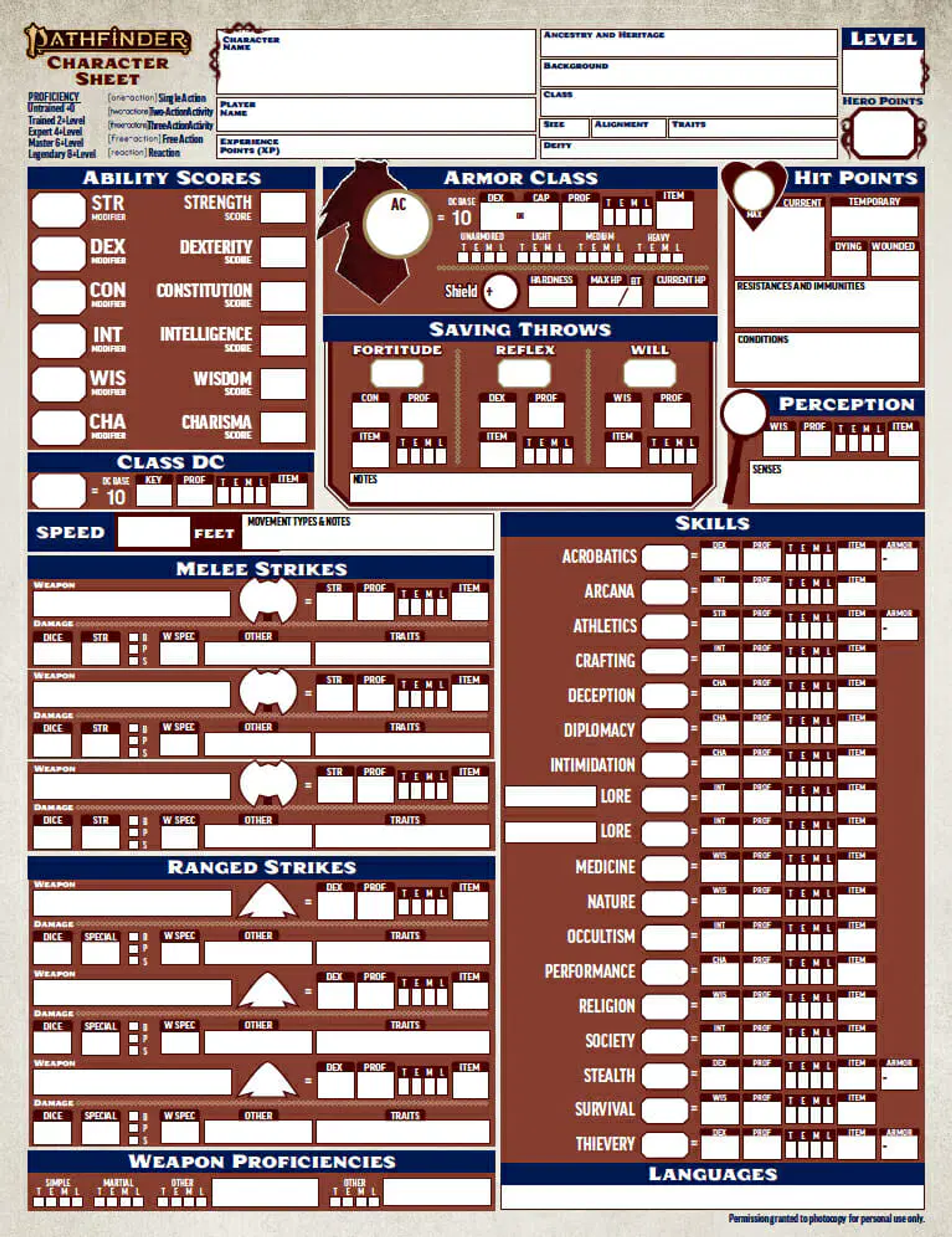
Anyone up for some tax returns? I dunno, I shouldn’t dunk on other people’s fun. But this sheet... it’s not for me.
One last personal favorite set of sheets from Dream Askew // Dream Apart:

First, the playbooks. These are SO EASY to use. You look at the first column for a brief overview. Second column for character creation. Third column for play. It’s an absolute breeze to get started, and basically all the rules you need during play are right there on the sheet. The fact that the game is so well designed is a big part of what makes that possible. They didn’t even have to shrink the font down to an unreadable size.
The white space is nice. The writing, both in the intro paragraph and in the pick list options, is amazing. There’s not much in the way of visual vibes here, though the header font helps, and the vibes in the writing make up for it.
If you’re going to rely mostly on text instead of graphic design, this is how you fucking do it.

We continue on to the setting elements, basically the GM role split over six pieces, distributed among players, and passed around during play.
I wish there was a bit more white space, but everything else here is great. The Sources section is an excellent way of grounding the player in a collection of sources to draw on, ranging from novels to the Talmud. This is helpful when you pick up this setting element and aren’t sure what to do with it, but also safely and easily ignored in the way it’s kept to the right side of the sheet by the center line.
Meanwhile everything mechanical you actually need on the sheet is kept nice and tidy in the lower left. The layout once again leaves mood and setting to the language of the text rather than visuals, which are kept simple and well-organized for maximum clarity and useability. Bravo.
One last treat before I go: here’s a few super super old D&D sheets for OD&D and and AD&D 1e that Emanoel found while researching the episode:


What fun. I love the crease in that first one! RPG history is so cool.